
Creation of a personal Corporate Visual Identity focused on the fields of animation, photography, and graphic design. It is inspired by my personal interests, such as animation, photography, cinema, and Japanese culture.


It features two key elements that stand out: the “V” and the dot. The decision to make the “V” different comes from the fact that the name consists of three letters, two of which are vowels, so the “V” needed to stand out. The dot, on the other hand, symbolizes the act of recording.
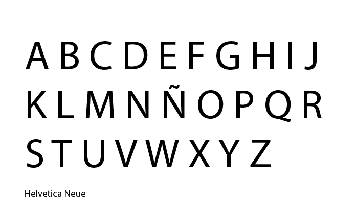
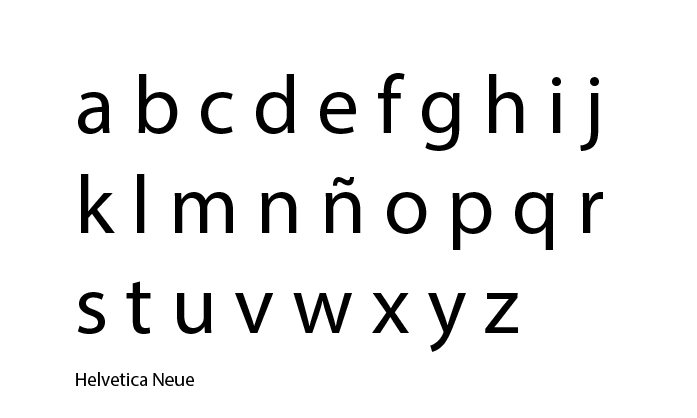
The typeface used is Helvetica Neue, a clean and rounded font that, combined with the use of lowercase letters, gives it a friendly and approachable character.
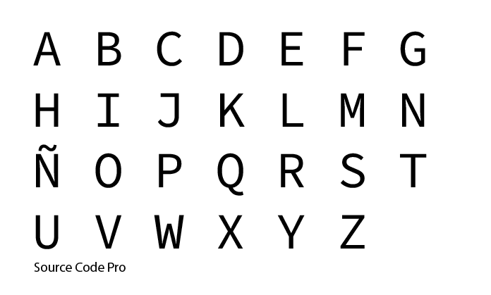
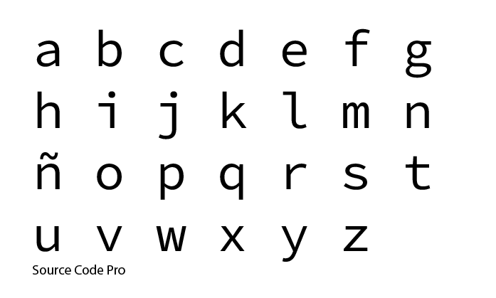
It is accompanied by a second typeface: Source Code Pro. More rectangular and mechanical, it helps create contrast with Helvetica Neue.

The corporate colors are red, black, and white—intense tones that are frequently used in the cinematic field due to their strong visual impact.
“Project carried out in the Higher Vocational Training in Advertising Graphics, BHI IES-Usandizaga.“