
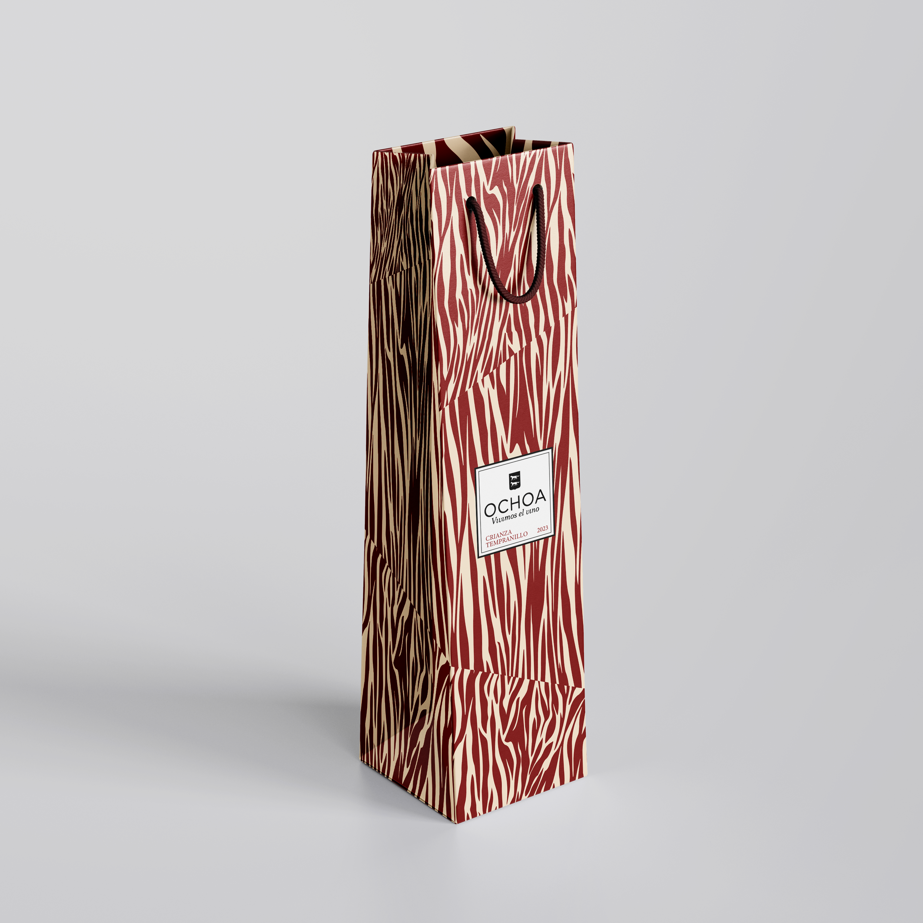
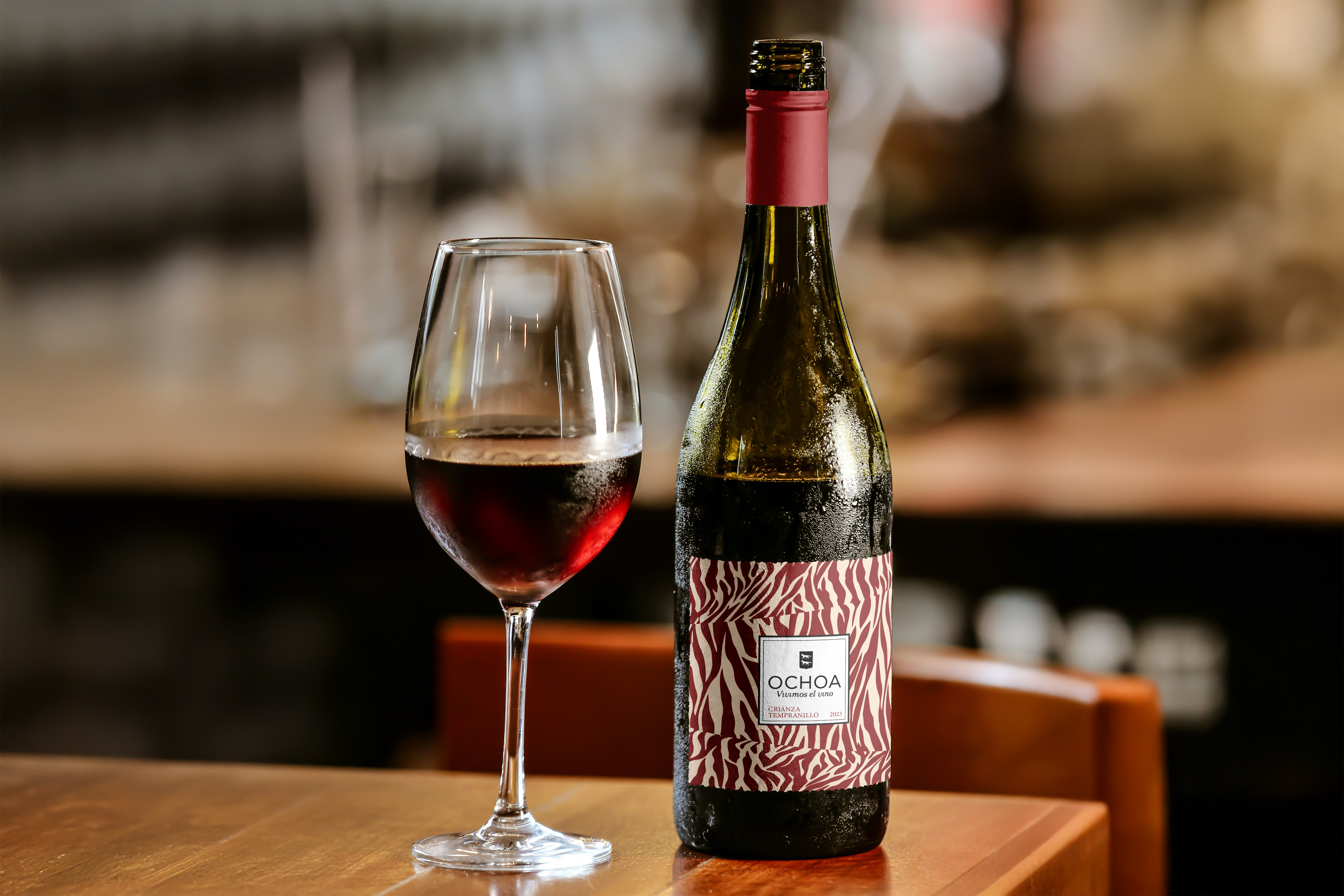
Label design for Vinos Ochoa, specifically for their Tempranillo wine, aimed at conveying an elegant and professional image while remaining accessible to a broad audience. The focus was on achieving a balance between the tradition and essence of the wine and a contemporary aesthetic through a clean and carefully structured design.


The choice of colors —beige and red— reflects the intention to evoke tradition and warmth, with a contemporary touch that connects with a modern audience. This palette gives the label presence and distinction, while also reinforcing the identity of the wine.
The composition is designed to facilitate reading and clearly highlight key information. The typographic element and the arrangement of visual elements provide order and coherence, achieving a balanced and visually appealing design.

“Project proposal carried out in the Higher Vocational Training in Advertising Graphics, BHI IES-Usandizaga.“